
About DeliverEase
DeliverEase aims to help food delivery drivers succesfully complete their orders in as little time and with as little stress as possible.
Food delivery drivers are frustrated with the delivery process. Time to deliver is higher than necessary because drivers do not have the adequate tools to get their job done efficiently.
By focusing on quick address input, easy route management, and helpful data overlays, DeliverEase makes delivering a breeze.
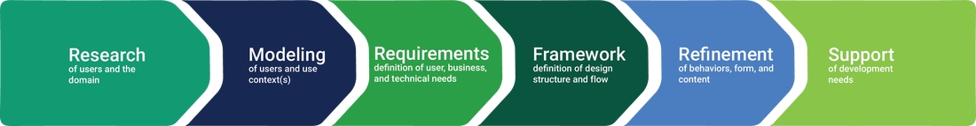
We completed this project as part of HCDE 318, which is an upper-level undergraduate course we took this Autumn 2016 in User Experience Design at the University of Washington. One of the first things we learned in HCDE 318 this quarter was the importance of approaching the design process from a goal-directed perspective. As we moved through each phase of our design process in creating DeliverEase this quarter, referring to this outline (which was provided to us during the first few weeks of the quarter) as a guide helped us ensure we stayed on track to our goals.
|
Gathering data from users is vital to a project's success. It helps clarify the problem and reason for the project, and shapes the correct solution.
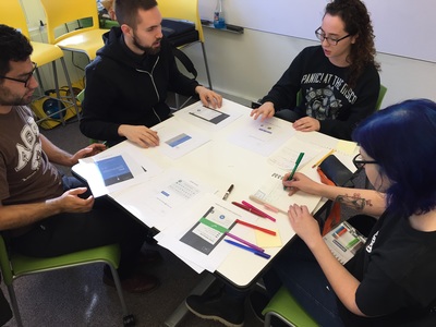
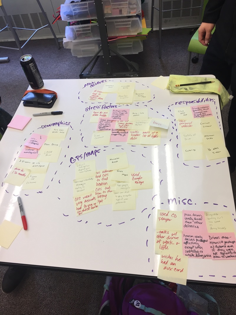
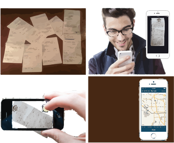
Our team set up interviews with delivery drivers of different sorts, including a few delivery customers. In analyzing these interviews, we realized that many of the food delivery drivers shared common themes; they were often under stress due to time constraints on their deliveries, especially when taking multiple orders at once, had difficulty finding building or house numbers due to various factors (e.g. weather, lighting, overgrowth, etc.), and were familiar with Google Maps almost exclusively. Our research suggested targeting a solution at the food delivery industry. We knew that we had to focus on making address input as quick and seamless as possible, provide an intuitive route management screen, and display data to the driver that aids in quickly getting them to the customer’s door. Speed and ease would be essential for our primary users, due to the high stress context in which they work. The data we collected on food delivery drivers allowed us to understand the demographics, paint points, and desires of our primary users, which was necessary for creating usable personas for our project. |
|
|
Our research — which consisted of directed interviews as well as competitor analysis, online forums, and Bureau of Labor statistics — was aggregated and used to identify key behaviors and motivations of our users.
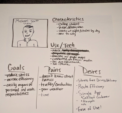
A variety of personas were created: archetypes derived from our data which helped remind our team who are users are, as well as their needs and desires. We had originally created a persona character for bike delivery, but it became clear that we did not have the time or resources necessary to provide a proper solution for driving and alternative modes of transportation often used for delivery. The bike delivery persona was set aside for a potential future feature update. Pictured to the right are the high-fidelity versions of both the car and bike delivery driver personas. As we continued forward in the design process, our team made a decision to narrow our scope in order to provide a better solution to our primary demographic: food delivery drivers. Focusing on food delivery drivers strengthened our connection to the driver personas and the clear focus aided in creating context scenarios in which one of our personas might use our app. |
|
Before we even started sketching any designs, our team created context scenarios for our personas. We wanted to explore how our product could best serve the needs of food delivery drivers without having to worry about which technologies we would use, or how our interface would work.
Thinking of our personas as real people helped us imagine the contexts in which our product would be used and how it would solve the needs and desires we had identified previously. Our records of interviews were essential in this aspect, allowing us to observe how our users defined and described their daily work flows, job responsibilities and paint points.
Context scenarios helped us start to think about our app’s keypaths, and how these could best be designed to aid the user in achieving their goals.
|
By the time we started sketching out design ideas, our team had a fairly good idea about the features our app would include. We further refined our context scenarios, using them to create key paths through our app. These key paths would be the ways in which a user would use the app to achieve a specific goal, such as adding an address and navigating to their destination. Our key paths would be revised as we continued our design process, but even in their initial state, they allowed our team to think about the features our app would include and how these features would work together.
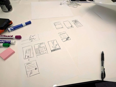
Keeping in mind potential features and keypaths, our team brainstormed how these might look and function. We quickly sketched ideas for inputting addresses, managing queued routes, crowdsourced notes and address information, data overlays for the map view and so on. We then chose some of the most promising sketch ideas from our brainstorm — notably, the route management screen, the picture address input method, and crowdsourced notes — and created more detailed sketches that included information about the sketch, more exact layouts, and interaction operation screens. |
|
|
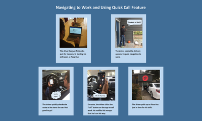
Our next step was to take the design sketches and keypaths and develop storyboards. The purpose of developing storyboards was to envision how our user would go through our scenarios and key paths, while interacting with our app.
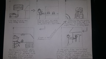
We created the storyboards by incorporating key features from our design sketches into key path and context scenarios. We then practiced use of standard storytelling elements to demonstrate a complete narrative of the user. These element were the inclusion and placement of text, people, level of detail, and representation of time. Pictured to the right are Olivia's pair of storyboards, and linked below are the storyboards completed individually by each member of our team. Our storyboards helped us further consider the contexts within which our app would be used in real life, and flesh out the details of what our users would require in a slightly less hypothetical version of our imagined situation leading into creating our information architecture. |
|
|
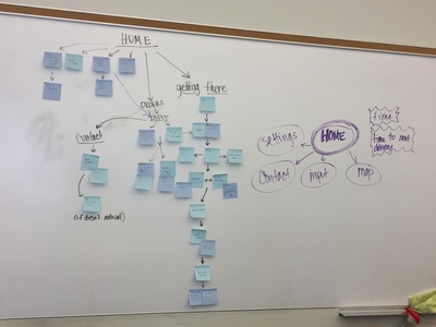
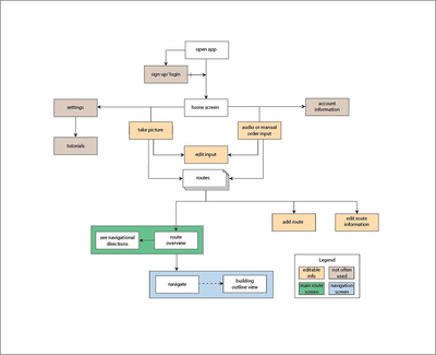
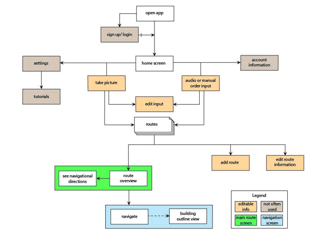
After researching our target audience and imagining how they will interact with our application based on this research, we began creating something tangible. Knowing that our personas want an application that is quick and easy to use due to time constraints on the job, influenced our decision to avoid a deep sitemap, allowing every function accessible within a few clicks.
The sitemap shows how all of the web pages are connected and how the user can move between them. This assignment shaped our prototypes, wireframes, and high fidelity mockups design as well because it showed what was most important. |
|
|
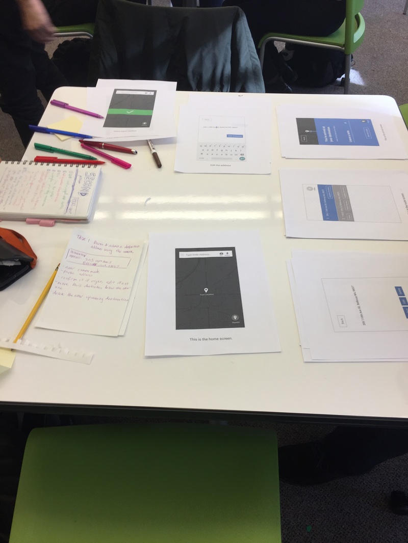
Once we had completed our sitemap, we were able to start making the first prototype of our project: a paper prototype of one of our key paths. The paper prototype allowed our team to test important aspects of our app — address input and route management — without having to commit large amounts of time or other resources that would be required in higher fidelity code prototypes, or similar prototypes.
We asked our test subjects to perform such tasks:
Testing with the paper prototype highlighted flaws within our key paths and confusion in our layout. The paper prototype, being such low fidelity, allowed our team to make quick edits and retest until our key path flow worked as desired. The data we gathered from user testing and user complaints and comments were compiled into our evaluation findings. These findings were instrumental in improving our key paths and app as a whole. Most helpfully, our team received information that was unexpected, compelling us to make changes to our designs we could have not foreseen otherwise. |

|
After testing our paper prototype and receiving feedback from both our peers and our non-HCDE test subjects, we then completed a report on our findings. The bulk of the our app’s route input flow was complete and tested to positive feedback, though there were some details of clarification and finesse that needed to be added. Our route management screen had some good ideas, but was not intuitive to use the tested state. There was no obvious way for users to change route order, and route features needed to be more consistent throughout. The user should not have to play whac-a-mole with the interface to discover a feature they want. Some of our flow regarding notes and navigation directions and route overview needed to be rethought as well.
Our testing and evaluations highlighted areas where are app did and did not meet the expectations of the user. This was especially useful to our team, as our testing showed that one of our key features, route management, was the biggest source of confusion for users. We made sure to take a note of everything we learned and went back to our previous route designs to make much needed improvements.
Our testing and evaluations highlighted areas where are app did and did not meet the expectations of the user. This was especially useful to our team, as our testing showed that one of our key features, route management, was the biggest source of confusion for users. We made sure to take a note of everything we learned and went back to our previous route designs to make much needed improvements.
|
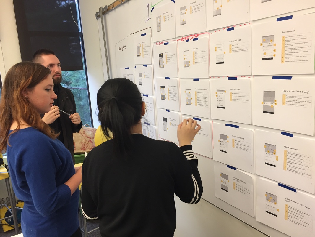
Reflecting on what we learned from testing our paper prototype, we created low/medium-fidelity monochrome wireframes for every screen of our app, complete with annotations which described functions which may have not been completely obvious. Annotations also played an important role in justifying design designs that our team made. Wireframes were created in the context of user research and testing, and annotations help explain layout choices so the reader is not left confused.
Wireframing the entire app also allowed us to identify weak spots we might have otherwise glossed over and helped create cohesion in our app — both via key path flows and other elements. We brought our wireframes to class and participated in a critique, which helped us prepare to create our final project piece: high-fidelity mockups of several key screens in our project. |
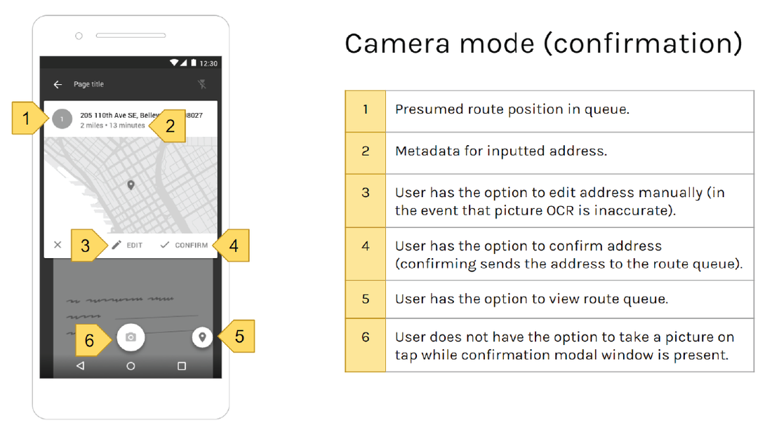
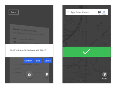
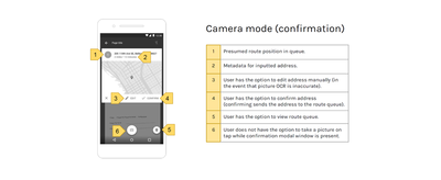
This is an example of one of our annotated wireframes. It shows the edit or confirm popup menu which appears when a user photographs an order slip to parse the address and input it for navigation.
|
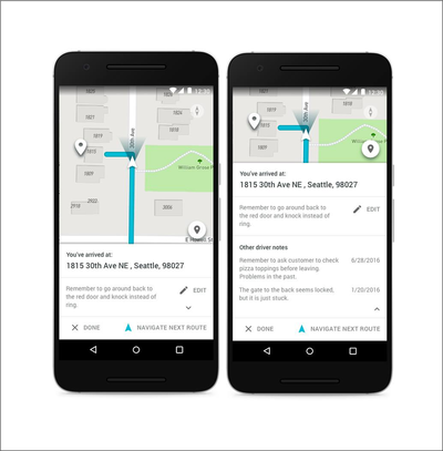
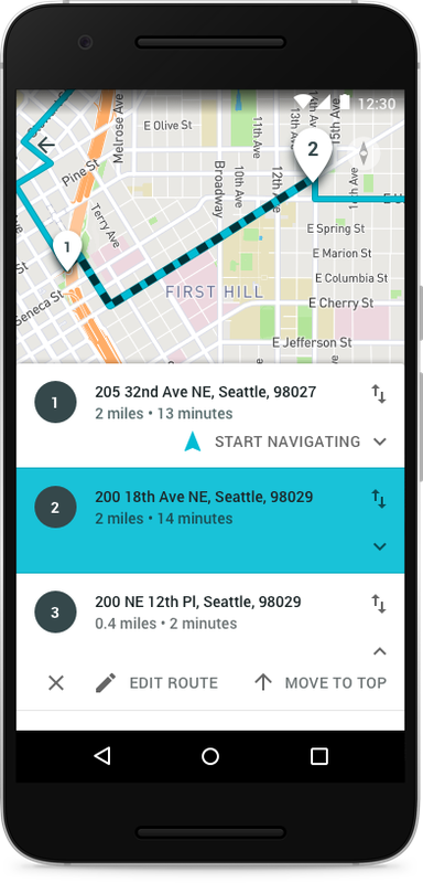
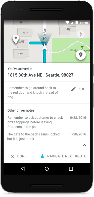
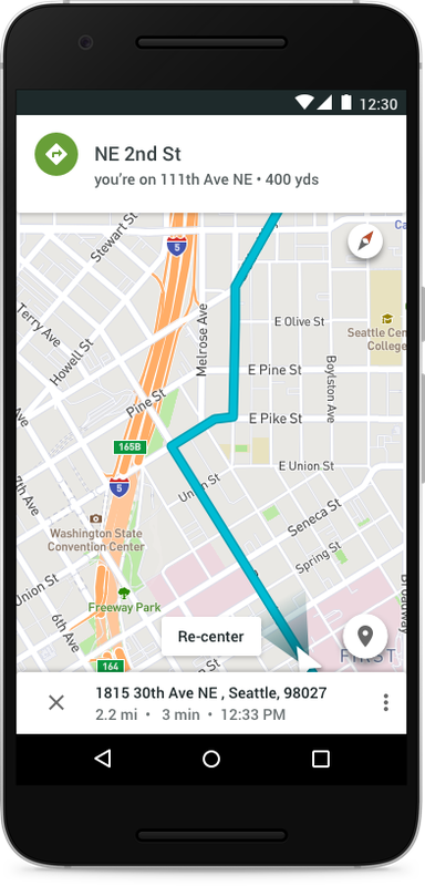
Our high fidelity mockups represent the culmination of a quarter full of research, testing, revisions, more testing, more revision, and lots of hard work! The high fidelity mockups were creating using Sketch, using what worked with our wireframes, and improving the things that did not work as well.
By adding high levels of detail, including color and iconography, the high fidelity mockup presents an almost real world example of using the final product — minus actual interactions. We did not include any annotations or explanations to go alongside our high fidelity mockups, as they represent a stage of the project at which substantial revisions should be light or absent, and the product should make sense to the user.
High fidelity mockups were not created for the entire app, but rather for specific and important key paths through our product. Our research showed that the input of addresses, management of routes, and navigation data was important to our users. Our high fidelity mockups show screens for all of these goals.
|
|
|